- Afrikaans
- Albanian
- Amharic
- Arabic
- Armenian
- Azerbaijani
- Basque
- Belarusian
- Bengali
- Bosnian
- Bulgarian
- Catalan
- Cebuano
- chinese_simplified
- chinese_traditional
- Corsican
- Croatian
- Czech
- Danish
- Dutch
- English
- Esperanto
- Estonian
- Finnish
- French
- Frisian
- Galician
- Georgian
- German
- Greek
- Gujarati
- haitian_creole
- hausa
- hawaiian
- Hebrew
- Hindi
- Miao
- Hungarian
- Icelandic
- igbo
- Indonesian
- irish
- Italian
- Japanese
- Javanese
- Kannada
- kazakh
- Khmer
- Rwandese
- Korean
- Kurdish
- Kyrgyz
- Lao
- Latin
- Latvian
- Lithuanian
- Luxembourgish
- Macedonian
- Malgashi
- Malay
- Malayalam
- Maltese
- Maori
- Marathi
- Mongolian
- Myanmar
- Nepali
- Norwegian
- Norwegian
- Occitan
- Pashto
- Persian
- Polish
- Portuguese
- Punjabi
- Romanian
- Russian
- Samoan
- scottish-gaelic
- Serbian
- Sesotho
- Shona
- Sindhi
- Sinhala
- Slovak
- Slovenian
- Somali
- Spanish
- Sundanese
- Swahili
- Swedish
- Tagalog
- Tajik
- Tamil
- Tatar
- Telugu
- Thai
- Turkish
- Turkmen
- Ukrainian
- Urdu
- Uighur
- Uzbek
- Vietnamese
- Welsh
- Bantu
- Yiddish
- Yoruba
- Zulu

pantone red color chart
Understanding Pantone Red The Essence of Color in Design and Branding
Color plays a fundamental role in design, influencing perceptions, emotions, and behaviors. Among the plethora of colors in the spectrum, red occupies a unique and powerful position. The Pantone Matching System (PMS) provides designers and brands with standardized colors, ensuring consistency across various mediums. Pantone red is particularly noteworthy, as it symbolizes passion, energy, and action.
The Significance of Pantone Red
The color red has psychological implications that are widely acknowledged in marketing and branding. It is known to evoke strong emotions and convey a sense of urgency. This makes it an effective choice for brands looking to grab attention quickly. Whether it’s the iconic red of Coca-Cola or the vibrant hue of a ‘Sale’ sign, red communicates excitement and drives consumers to act.
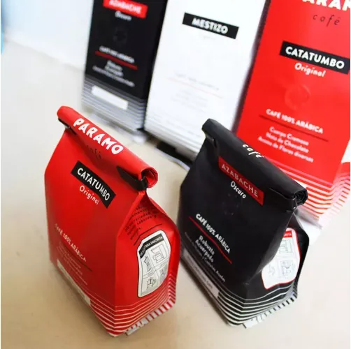
Pantone 186 C is one of the most recognized shades of red in the Pantone palette. It is vivid and assertive, often associated with energy and enthusiasm. Many sports teams, brands, and cultural institutions use this shade to create a bold identity that stands out in a busy marketplace. The vibrancy of this hue stimulates the senses, making it an excellent choice for marketing campaigns that aim to create immediate interest.
The Cultural Context of Red
In various cultures, red carries different meanings. In Western contexts, it often represents love, passion, and desire, making it a popular choice for Valentine’s Day promotions. Conversely, in many Eastern cultures, red signifies good fortune and prosperity, frequently used in festive decorations and weddings. Understanding these cultural nuances is crucial for brands that operate internationally. Adapting the use of Pantone red based on cultural significance can enhance brand acceptance and resonate more deeply with diverse audiences.
Incorporating Pantone Red in Design
pantone red color chart
When incorporating Pantone red into design, consider how it interacts with other colors. For instance, pairing Pantone red with neutral colors like white or grey can create a modern and clean aesthetic. Conversely, combining it with darker shades like black can evoke a sense of luxury and sophistication. Designers often use color wheels to explore complementary and contrasting colors, finding the perfect match for Pantone red that delivers the intended message.
Typography also plays a significant role in how Pantone red is perceived. Bold, sans-serif fonts enhance the energetic vibe of red, while serif fonts can add a touch of elegance. The overall design layout—be it minimalistic or elaborate—will influence how the color is perceived. Thus, it’s essential to consider the entire design composition when utilizing Pantone red.
The Use of Pantone Red in Brand Identity
Creating a strong brand identity means choosing a color palette that reflects the brand's values and resonates with its target audience. Many successful brands have integrated Pantone red into their identities. For example, brands like Target, Netflix, and YouTube have effectively utilized this color to create memorable and distinctive logos that stand out in a crowded market.
Beyond logos, using Pantone red in packaging, social media graphics, and marketing materials can reinforce brand recognition. Consistency is key in color application; whether used in print, digital, or environmental branding, maintaining the same shade of Pantone red will help establish a cohesive brand experience.
Conclusion
Pantone red is more than just a color; it embodies emotion, energy, and a call to action. Understanding its psychological impact, cultural nuances, and effective application techniques is vital for designers and marketers. By leveraging the power of Pantone red, brands can create meaningful connections with their audiences, drive engagement, and ultimately foster loyalty. As design continues to evolve, the usage of Pantone red will remain a significant strategy in the realm of branding, resonating with consumers on various levels, whether through passion, excitement, or cultural significance. This timeless color will undoubtedly continue to play a central role in the world of design and marketing for years to come.


- No. 6 Hefu Road, Hengjiang Industrial Zone, Gaoming District, Foshan, Guangdong Province,China
- Tel: 86-133 3649 8096
- Email:enid@bc-pak.com
-


