- Afrikaans
- Albanian
- Amharic
- Arabic
- Armenian
- Azerbaijani
- Basque
- Belarusian
- Bengali
- Bosnian
- Bulgarian
- Catalan
- Cebuano
- chinese_simplified
- chinese_traditional
- Corsican
- Croatian
- Czech
- Danish
- Dutch
- English
- Esperanto
- Estonian
- Finnish
- French
- Frisian
- Galician
- Georgian
- German
- Greek
- Gujarati
- haitian_creole
- hausa
- hawaiian
- Hebrew
- Hindi
- Miao
- Hungarian
- Icelandic
- igbo
- Indonesian
- irish
- Italian
- Japanese
- Javanese
- Kannada
- kazakh
- Khmer
- Rwandese
- Korean
- Kurdish
- Kyrgyz
- Lao
- Latin
- Latvian
- Lithuanian
- Luxembourgish
- Macedonian
- Malgashi
- Malay
- Malayalam
- Maltese
- Maori
- Marathi
- Mongolian
- Myanmar
- Nepali
- Norwegian
- Norwegian
- Occitan
- Pashto
- Persian
- Polish
- Portuguese
- Punjabi
- Romanian
- Russian
- Samoan
- scottish-gaelic
- Serbian
- Sesotho
- Shona
- Sindhi
- Sinhala
- Slovak
- Slovenian
- Somali
- Spanish
- Sundanese
- Swahili
- Swedish
- Tagalog
- Tajik
- Tamil
- Tatar
- Telugu
- Thai
- Turkish
- Turkmen
- Ukrainian
- Urdu
- Uighur
- Uzbek
- Vietnamese
- Welsh
- Bantu
- Yiddish
- Yoruba
- Zulu
Exploring the Vibrant Hue of Pantone 7506 C and Its Design Applications
The Allure of 7506 C Pantone A Study in Color and Emotion
In the world of design, color is more than just an aesthetic choice; it’s a powerful tool that can evoke emotions, set moods, and communicate messages without saying a word. Among the myriad of colors available, Pantone 7506 C stands out as a particularly captivating shade. With its warm and earthy tones, it embodies a sense of calm and stability, making it a favored choice in various design fields. This article delves into the attributes of 7506 C, explores its psychological impact, and discusses its applications across different industries.
What is Pantone 7506 C?
Pantone 7506 C is part of the Pantone color matching system, which is widely used in industries such as graphic design, fashion, and interior design. This specific shade is characterized by a warm beige hue, with soft undertones that can shift slightly depending on the light and surrounding colors. It is a versatile nude that blends beautifully with other colors, making it a cornerstone for palettes that aim to emphasize tranquility and harmony.
Psychological Impact of 7506 C
Colors play a critical role in human psychology, and Pantone 7506 C is no exception. Its warm, natural appearance tends to evoke feelings of serenity and comfort. In many cultures, beige and similar earthy tones symbolize stability, reliability, and groundedness. The comfort of 7506 C can be particularly appealing in environments meant for relaxation, such as homes, spas, and wellness centers. By incorporating this tone, designers can create spaces that foster peace and wellbeing.
Moreover, beige is often associated with simplicity and sophistication, further enhancing its appeal in contemporary design. In a world where consumers are increasingly gravitating toward minimalist and sustainable aesthetics, Pantone 7506 C resonates as a choice that aligns with both elegance and environmental consciousness.
Applications in Interior Design
7506 c pantone

In interior design, Pantone 7506 C is frequently utilized to create soft, inviting spaces. It works beautifully as a base color for walls and furnishings, allowing other design elements—such as artwork or textiles—to stand out without clashing. This shade pairs exceptionally well with both bold and muted colors, making it an ideal choice for layered decor. For example, when paired with deep greens, vibrant blues, or rich browns, it establishes a grounded yet dynamic atmosphere.
Given its warm undertones, 7506 C can also convey a sense of nostalgia. Many designers choose this shade to evoke vintage or rustic themes, often seen in farmhouse-style kitchens or cozy living rooms. Its ability to blend modern minimalism with traditional comfort is what makes it so versatile.
Use in Branding and Marketing
In branding, colors play a pivotal role in shaping consumer perception. Companies that utilize Pantone 7506 C in their branding materials convey a message of reliability and warmth. Brands associated with beauty, wellness, and lifestyle often adopt this shade to create an inviting visual identity that resonates with their target audience.
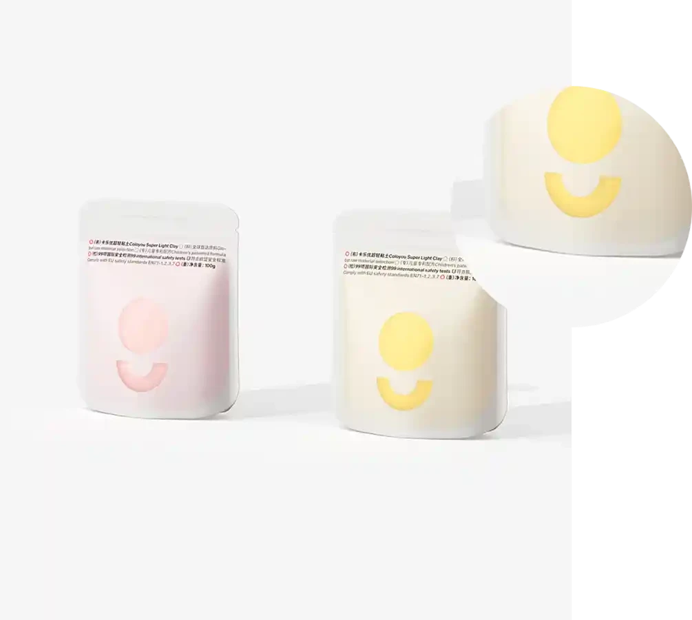
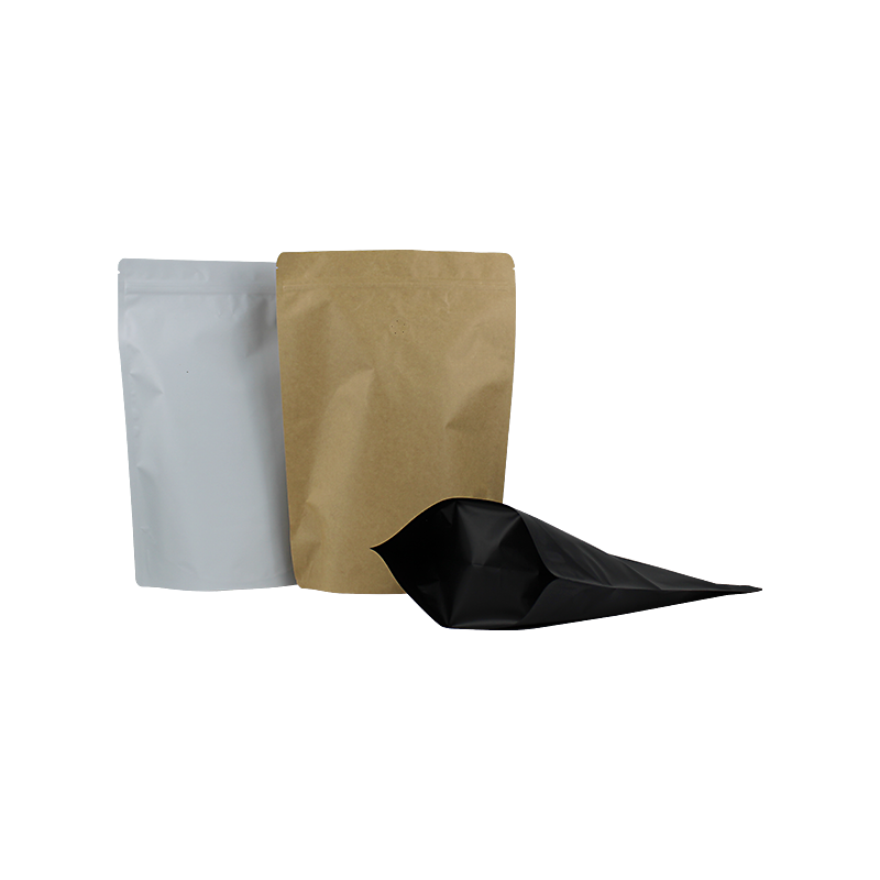
For marketing campaigns, 7506 C can be an excellent choice for backgrounds, packaging, and promotional materials. It gives a subtle yet sophisticated backdrop, allowing products to take center stage while still maintaining an emotional connection with consumers. The warmth of the color can also enhance feelings of trust and credibility, essential qualities for brands aiming to cultivate loyal customer relationships.
Conclusion
Pantone 7506 C is more than just a color; it is an emotion, a statement, and a design philosophy. Its warm, earthy tones create a sense of tranquility and stability, making it an ideal choice for both personal and professional spaces. Whether in interior design, branding, or marketing, this versatile shade enhances aesthetics while connecting with people on a deeper level. As the world continues to evolve, the timeless appeal of Pantone 7506 C remains relevant, proving that in the realm of color, some shades never lose their charm. Embracing this captivating hue can lead to environments, brands, and experiences that resonate with beauty, comfort, and sophistication.

