- Afrikaans
- Albanian
- Amharic
- Arabic
- Armenian
- Azerbaijani
- Basque
- Belarusian
- Bengali
- Bosnian
- Bulgarian
- Catalan
- Cebuano
- chinese_simplified
- chinese_traditional
- Corsican
- Croatian
- Czech
- Danish
- Dutch
- English
- Esperanto
- Estonian
- Finnish
- French
- Frisian
- Galician
- Georgian
- German
- Greek
- Gujarati
- haitian_creole
- hausa
- hawaiian
- Hebrew
- Hindi
- Miao
- Hungarian
- Icelandic
- igbo
- Indonesian
- irish
- Italian
- Japanese
- Javanese
- Kannada
- kazakh
- Khmer
- Rwandese
- Korean
- Kurdish
- Kyrgyz
- Lao
- Latin
- Latvian
- Lithuanian
- Luxembourgish
- Macedonian
- Malgashi
- Malay
- Malayalam
- Maltese
- Maori
- Marathi
- Mongolian
- Myanmar
- Nepali
- Norwegian
- Norwegian
- Occitan
- Pashto
- Persian
- Polish
- Portuguese
- Punjabi
- Romanian
- Russian
- Samoan
- scottish-gaelic
- Serbian
- Sesotho
- Shona
- Sindhi
- Sinhala
- Slovak
- Slovenian
- Somali
- Spanish
- Sundanese
- Swahili
- Swedish
- Tagalog
- Tajik
- Tamil
- Tatar
- Telugu
- Thai
- Turkish
- Turkmen
- Ukrainian
- Urdu
- Uighur
- Uzbek
- Vietnamese
- Welsh
- Bantu
- Yiddish
- Yoruba
- Zulu
Finding the Perfect Pantone Color Match for Your Project Needs
The Importance of Color Matching Understanding Match Pantone Colors
In the world of design, color plays a crucial role in creating visual appeal and conveying messages. Among the various systems used for color matching, the Pantone Matching System (PMS) stands out as a global standard. Whether in fashion, graphics, or interior design, understanding and using match Pantone colors effectively can elevate the quality of your projects, ensuring they resonate well with your target audience.
What is Pantone?
The Pantone Matching System is a standardized color reproduction system that allows designers, manufacturers, and clients to communicate more effectively about colors. Established in the 1960s, Pantone assigns unique codes to specific colors, providing a universal reference that transcends variations in output devices, materials, and technologies. This means that when a designer specifies a Pantone color, it can be reproduced with remarkable consistency, whether it’s printed on paper, fabric, or any other material.
The Psychology of Color
Color carries significant psychological meaning and affects human emotions and behaviors. For instance, blue is often associated with trust and calmness, making it a popular choice for corporate branding. In contrast, red exudes energy and passion, frequently utilized in marketing campaigns to grab attention. When designers select match Pantone colors, they must consider how each color aligns with the brand’s identity and the message it wants to convey. The right color can enhance brand recognition, evoke desired emotions, and prompt consumer action.
Choosing the Right Match Pantone Color
Selecting the right Pantone color involves several considerations. First, designers must take into account the brand’s existing color palette. What colors are currently in use? How can a new Pantone color complement or contrast with these existing colors? The goal is to create a harmonious and visually appealing palette that reflects the brand’s ethos.
match pantone color
Next, the context in which the color will be used matters significantly. For example, a color that looks fantastic on a digital screen may not translate well to print. Thus, it is essential to test colors in various formats to ensure they maintain their integrity. Pantone provides swatch books and digital tools to help designers visualize how colors will appear across different media.
Finally, cultural considerations should not be overlooked when choosing Pantone colors. Different cultures may interpret colors differently, so it is vital to conduct research to ensure that the selected colors resonate positively with the intended audience.
The Role of Match Pantone Colors Across Industries
Match Pantone colors play a pivotal role in various industries. In the fashion industry, for example, designers often refer to Pantone colors when creating collections for each season. The influence of certain colors can vary from year to year, as seen in Pantone’s announcement of its Color of the Year, which sets trends and inspires designers worldwide.
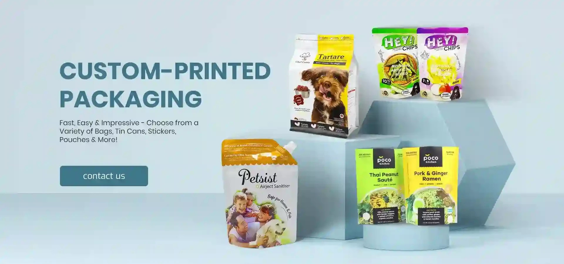
In the graphic design world, agencies use Pantone colors to maintain consistency across different marketing materials, ensuring that the brand is instantly recognizable. Packaging, websites, and promotional materials all benefit from cohesive color schemes that accurately represent the brand's voice.
Interior design also utilizes match Pantone colors to create spaces that evoke specific feelings and atmospheres. The right color combinations can make a space feel calm or energetic, spacious or cozy, hence designers carefully select Pantone colors to achieve their desired effects.
Conclusion
In conclusion, understanding and applying match Pantone colors is essential for anyone involved in design, whether it be fashion, graphics, branding, or interior design. The ability to communicate effectively about color ensures consistency, enhances aesthetic appeal, and resonates with the audience on an emotional level. As designers continue to navigate the complexities of color selection, Pantone remains a vital tool in their arsenal, helping them bring their visions to life while adhering to the standards of quality and creativity that define successful design. By embracing the power of color and the precision of the Pantone Matching System, designers can create impactful visuals that stand the test of time, establishing a connection with their audience that is both immediate and lasting.

