- Afrikaans
- Albanian
- Amharic
- Arabic
- Armenian
- Azerbaijani
- Basque
- Belarusian
- Bengali
- Bosnian
- Bulgarian
- Catalan
- Cebuano
- chinese_simplified
- chinese_traditional
- Corsican
- Croatian
- Czech
- Danish
- Dutch
- English
- Esperanto
- Estonian
- Finnish
- French
- Frisian
- Galician
- Georgian
- German
- Greek
- Gujarati
- haitian_creole
- hausa
- hawaiian
- Hebrew
- Hindi
- Miao
- Hungarian
- Icelandic
- igbo
- Indonesian
- irish
- Italian
- Japanese
- Javanese
- Kannada
- kazakh
- Khmer
- Rwandese
- Korean
- Kurdish
- Kyrgyz
- Lao
- Latin
- Latvian
- Lithuanian
- Luxembourgish
- Macedonian
- Malgashi
- Malay
- Malayalam
- Maltese
- Maori
- Marathi
- Mongolian
- Myanmar
- Nepali
- Norwegian
- Norwegian
- Occitan
- Pashto
- Persian
- Polish
- Portuguese
- Punjabi
- Romanian
- Russian
- Samoan
- scottish-gaelic
- Serbian
- Sesotho
- Shona
- Sindhi
- Sinhala
- Slovak
- Slovenian
- Somali
- Spanish
- Sundanese
- Swahili
- Swedish
- Tagalog
- Tajik
- Tamil
- Tatar
- Telugu
- Thai
- Turkish
- Turkmen
- Ukrainian
- Urdu
- Uighur
- Uzbek
- Vietnamese
- Welsh
- Bantu
- Yiddish
- Yoruba
- Zulu
Vibrant Pink Inspiration for Bold Creative Projects and Designs
Embracing the Vibrancy of Pantone 225 C
In the world of color, few hues capture attention quite like Pantone 225 C. This vibrant, hot pink shade is not just a color; it’s a statement, a mood, and a beacon of positivity. As we delve into the significance and applications of Pantone 225 C, it becomes clear why this color has garnered such popularity among designers and brands alike.
The Energy of Pantone 225 C
At its core, Pantone 225 C exudes energy and excitement. Its boldness evokes feelings of joy and creativity, making it a perfect choice for brands looking to convey playfulness and innovation. From fashion runways to graphic design, this striking pink has made its mark, resonating with audiences who are drawn to its lively persona. The shade’s brightness allows it to stand out, making it ideal for logos, advertisements, and products aimed at a youthful, dynamic demographic.
Historical Context of Pink in Culture
Historically, pink has been associated with femininity, love, and romance. However, the emergence of Pantone 225 C represents a shift towards a more inclusive interpretation of pink. Today, this color is embraced not just by women, but by a diverse range of communities, symbolizing empowerment and individuality. The LGBTQ+ community, for instance, has adopted vibrant pinks, including Pantone 225 C, as symbols of pride and resistance.
Psychological Impacts of Bright Colors
The psychological aspects of color cannot be overlooked. Psychologists suggest that bright colors like Pantone 225 C can stimulate feelings of happiness and enthusiasm. This vibrancy calls to mind memories of childhood and carefree moments, encouraging a sense of nostalgia and joy. In marketing and branding, the use of such colors can significantly affect consumer attitudes, making them more inclined to engage with a brand that radiates positivity.
pantone 225c
Applications in Design and Branding
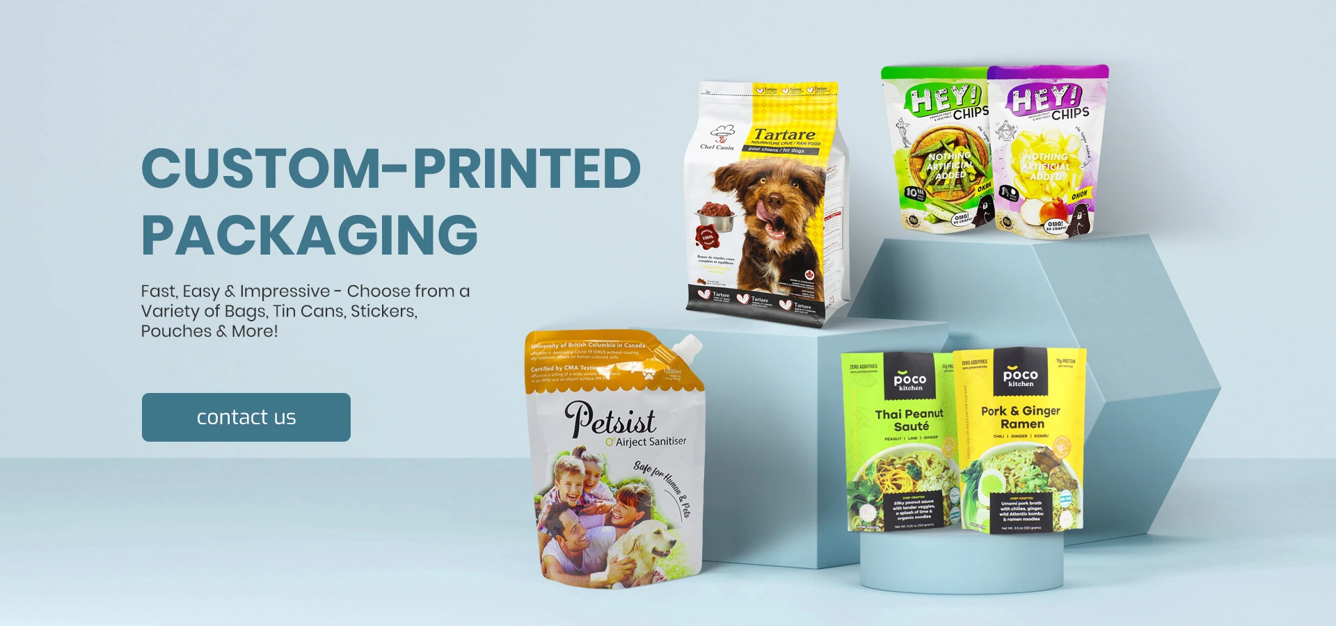
When it comes to design, Pantone 225 C can be employed in various ways. Its bold nature makes it suitable for logos, packaging, and advertising materials, where capturing attention is crucial. Many companies have successfully integrated this color into their branding to project a fun, welcoming image. For instance, brands targeting a younger audience, such as cosmetics and apparel lines, often utilize Pantone 225 C to evoke trendiness and appeal.
Moreover, Pantone 225 C pairs beautifully with other colors, allowing designers to create eye-catching palettes. It works well with softer pastels, crisp whites, and even contrasting shades like deep blues or vibrant oranges, offering versatility in design schemes.
Fashion and Pantone 225 C
In the fashion industry, Pantone 225 C has been a go-to shade for designers who wish to make a statement. Whether on the catwalk or in everyday wear, this color can elevate a look, bringing a sense of boldness and vibrancy. Fashion collections that feature this hue often attract attention and admiration for their daring choices, positioning the brand as adventurous and trend-setting.
Conclusion
In conclusion, Pantone 225 C is more than just a color; it is a vibrant expression of joy, creativity, and individuality. Its influence spans various industries, from design and branding to fashion and cultural movements. As we continue to explore the world of color, Pantone 225 C remains a shining example of how a single hue can encapsulate the spirit of a generation, inviting us all to embrace its energy and enthusiasm. Whether in the realms of art, fashion, or personal expression, this color reminds us of the power of creativity and the joy that comes from boldly standing out.

