pms877
Understanding PMS877 A Comprehensive Overview
PMS877, a specific hue from the Pantone Matching System, finds its place in various industries, particularly in design, branding, and textiles. This color resonates with many due to its unique characteristics and the emotional qualities it evokes. In this article, we will delve into what PMS877 represents, its applications, and why it has become a popular choice for designers and brands alike.
The Significance of PMS877
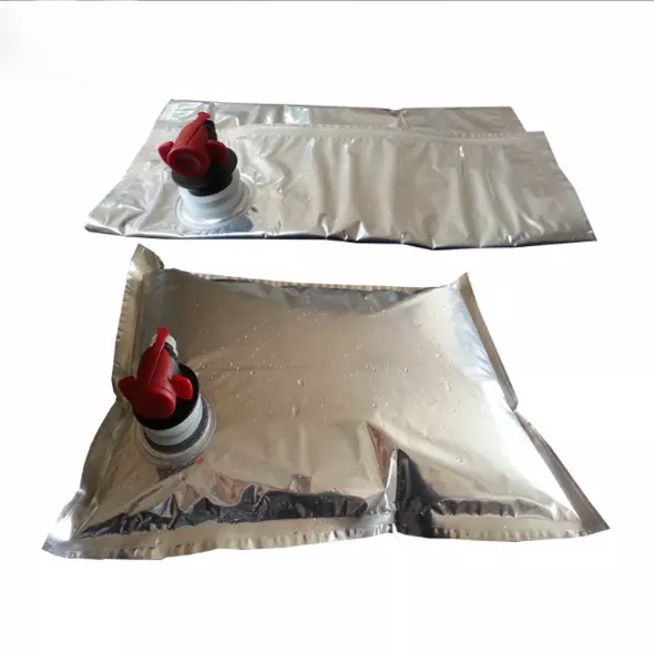
PMS877 is a metallic shade, often described as a deep silver tone that brings a sense of elegance and sophistication. Metallic colors like PMS877 are frequently used to convey a sense of luxury and high quality. The reflective quality of PMS877 creates a dynamic visual that captures light in a way that standard colors cannot, making it an ideal choice for packaging, branding, and product design.
In the realm of color psychology, silver tones are associated with modernity, innovation, and high-tech. They evoke feelings of wealth and prestige while maintaining a sleek, clean appearance. This makes PMS877 particularly effective for brands looking to position themselves at the forefront of technology and luxury markets.
Applications of PMS877
PMS877 is versatile and finds its use in various sectors. In the fashion industry, it is commonly used in textiles to provide a luxurious finish to garments and accessories. Designers often utilize this shade in evening wear or formal attire where an understated yet classy look is desired.
In branding, companies often adopt PMS877 to evoke a premium feel for their products or logos. High-end brands in automotive, cosmetics, or electronics frequently incorporate this color into their visual identity. For example, packaging for luxury fragrances may utilize PMS877 to enhance consumer perception of the product inside.
pms877
Print materials also benefit from the use of PMS877, particularly in high-end advertising campaigns. The metallic finish can draw attention and create a memorable visual impact in brochures, business cards, and other printed collateral.
The Design Process
Incorporating PMS877 into design requires careful consideration. As a metallic color, it behaves differently than standard hues. Designers must account for factors such as the type of material being printed on and the lighting conditions under which the design will be viewed. Digital representations can often differ significantly from physical products due to these factors.
To achieve the best results, designers should work closely with printers to understand how PMS877 will translate in different media. This collaborative approach ensures that the final product meets the intended vision and maintains color consistency across various applications.
Conclusion
PMS877 is more than just a color; it’s a statement of luxury, modernity, and innovation. Its versatility and ability to evoke strong emotional responses make it a preferred choice among designers and brands across various industries. As the importance of visual identity continues to grow in our ever-expanding market, colors like PMS877 will remain critical in shaping perceptions and enhancing brand value.
In essence, whether you are a designer looking to elevate your work or a brand aiming to establish a premium image, PMS877 offers a compelling option that embodies sophistication and style. Embracing this unique hue can pave the way for creating memorable experiences that resonate with consumers and set your work apart in a competitive landscape.

