- Afrikaans
- Albanian
- Amharic
- Arabic
- Armenian
- Azerbaijani
- Basque
- Belarusian
- Bengali
- Bosnian
- Bulgarian
- Catalan
- Cebuano
- chinese_simplified
- chinese_traditional
- Corsican
- Croatian
- Czech
- Danish
- Dutch
- English
- Esperanto
- Estonian
- Finnish
- French
- Frisian
- Galician
- Georgian
- German
- Greek
- Gujarati
- haitian_creole
- hausa
- hawaiian
- Hebrew
- Hindi
- Miao
- Hungarian
- Icelandic
- igbo
- Indonesian
- irish
- Italian
- Japanese
- Javanese
- Kannada
- kazakh
- Khmer
- Rwandese
- Korean
- Kurdish
- Kyrgyz
- Lao
- Latin
- Latvian
- Lithuanian
- Luxembourgish
- Macedonian
- Malgashi
- Malay
- Malayalam
- Maltese
- Maori
- Marathi
- Mongolian
- Myanmar
- Nepali
- Norwegian
- Norwegian
- Occitan
- Pashto
- Persian
- Polish
- Portuguese
- Punjabi
- Romanian
- Russian
- Samoan
- scottish-gaelic
- Serbian
- Sesotho
- Shona
- Sindhi
- Sinhala
- Slovak
- Slovenian
- Somali
- Spanish
- Sundanese
- Swahili
- Swedish
- Tagalog
- Tajik
- Tamil
- Tatar
- Telugu
- Thai
- Turkish
- Turkmen
- Ukrainian
- Urdu
- Uighur
- Uzbek
- Vietnamese
- Welsh
- Bantu
- Yiddish
- Yoruba
- Zulu
Understanding Pantone Colors and Their Importance in Design and Branding
Understanding Pantone Colors A Guide to the Color Matching System
Color plays a pivotal role in how we perceive the world around us. From branding to interior design, colors evoke emotions, create atmospheres, and convey messages. One of the most recognized systems for color identification and communication is the Pantone Matching System (PMS). Established in the 1960s, Pantone has become the industry standard for color specification, especially in the fields of graphic design, fashion, and product development.
What are Pantone Colors?
Pantone colors are standardized colors used in various industries to ensure consistency and accuracy in color representation. The Pantone system assigns a unique number to each color, allowing designers, manufacturers, and marketers to communicate specific shades effectively. This system eliminates confusion that can arise from color variations during production, ensuring that the final product matches the designer’s vision.
The Importance of Pantone in Branding
In branding, color is an essential element that can significantly influence consumer behavior. Companies often use specific colors to evoke particular feelings or associations. For example, blue is commonly associated with trust and reliability, making it a popular choice for financial institutions. To maintain brand integrity, it is crucial that companies use consistent colors across all their products, advertisements, and promotional materials. Pantone colors provide a reliable way to achieve this consistency, as they are universally recognized and can be matched across different materials and mediums.
How Pantone Colors are Created
what are pantone colors
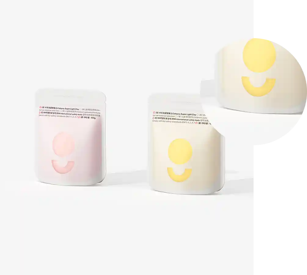
Pantone colors are created through a careful blending of pigments. The Pantone Matching System offers a wide range of colors, with new shades added regularly to reflect current trends and consumer preferences. Each color in the Pantone system comes with specifications that include information about its CMYK (cyan, magenta, yellow, black) and RGB (red, green, blue) values, as well as its hex code. This detailed information allows designers to reproduce colors accurately, whether they are working with print materials or digital designs.
The Role of Pantone in Design
For designers, using Pantone colors simplifies the creative process. When a designer selects a Pantone color, they can rest assured that its specifications will be the same regardless of the medium. This is particularly important for print designs, where colors can appear differently depending on the paper or printing process used. By using Pantone colors, designers can ensure that their vision translates seamlessly from screen to print.
Furthermore, Pantone often releases a Color of the Year, which reflects current trends and cultural movements. This announcement generates buzz within the design community and influences a wide range of industries, from fashion to interior design. The Color of the Year is often seen as a forecast of what hues will be popular in the coming months, driving consumer interest and inspiring new designs.
Conclusion
In conclusion, Pantone colors are more than just a collection of shades; they are a vital tool for color communication in various industries. Their standardized system ensures consistency and accuracy, allowing brands to maintain their identity while enabling designers to execute their visions effectively. As trends evolve and new colors emerge, Pantone will continue to play an essential role in shaping the way we interact with and perceive color in our daily lives. Whether you are a designer, marketer, or simply a color enthusiast, understanding Pantone colors can enhance your appreciation for the artistry and science behind color selection and application.

